On the unreasonable difficulty of plotting pretty rainbow, fast
The problem
I wanted to optimize the spectral display in tobes-ui because it’s slow to render (easily 0.2-0.5s) and rather washed out:
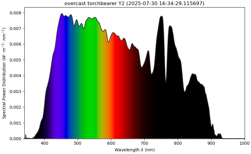 original tobes-ui 0.3.0 spectrum graph
This post shows the winding road to get a decent solution1.
And before you decide to dig in: The final version of my fix uses rather clever normalization of the spectrum2 together with precomputation and better use of matplotlib primitives to get something like 10-50x speedup with much nicer resulting rainbow.
The road to solution
I’m using something like:
self.axes.set_aspect('auto')
cmfs_data = {}
cmfs_source = colour.MSDS_CMFS["CIE 1931 2 Degree Standard Observer"]
use_range = self.VISIBLE_SPECTRUM if self.vis_x else self.data.wavelength_range
for wavelength in range(
    use_range.start,
    use_range.stop + 1
):
    cmfs_data[wavelength] = cmfs_source[wavelength]
cmfs = colour.MultiSpectralDistributions(cmfs_data)
colour.plotting.plot_single_sd(spd, cmfs, **kwargs)
plt.xlabel("Wavelength $\\lambda$ (nm)")
plt.ylabel(f'{self.YLABEL} ({self.data.y_axis})')
plt.title(self._graph_title(spd))
to plot the tobes spectrum graph.
But as mentioned in the intro, that’s both washed out and slooow.
The slowness comes mainly from the fact that the colour-science package
draws the whole thing piecemeal in thin strips (one actor per distinct color),
and then tries to clip the full rainbow based on the path.
So I set out to do better.
I searched around, played with the usual LLM suspects, and was relatively happy with the output of “Bruton’s Algorithm”, and also with what fell out of naive use of “CIE 1931 2° Standard Observer → sRGB” and “CIE 2015 10° Standard Observer → sRGB” conversion:
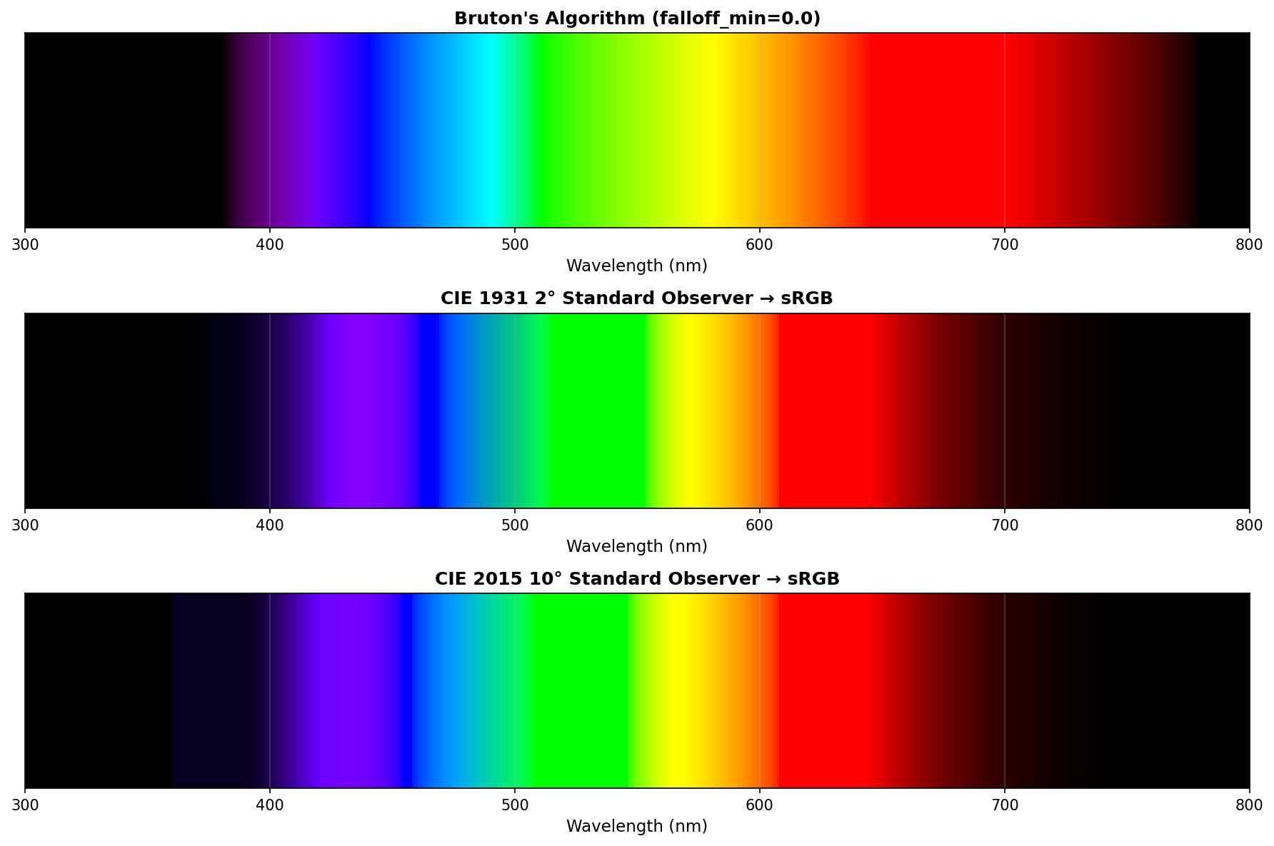
After all, that looks pretty, no?
Btw, it’s generated thusly:
almost-satisfactory.py (click to expand)
import numpy as np
import matplotlib.pyplot as plt
from matplotlib.patches import Rectangle
import colour


def bruton_wavelength_to_rgb(wavelength, falloff_min=0.3):
    """
    Bruton's algorithm with configurable intensity falloff.

    Args:
        wavelength: Wavelength in nm
        falloff_min: Minimum intensity factor at edges (0.0-1.0)
    """
    gamma = 0.80
    intensity_max = 255

    if 380 <= wavelength < 440:
        red = -(wavelength - 440) / (440 - 380)
        green = 0.0
        blue = 1.0
    elif 440 <= wavelength < 490:
        red = 0.0
        green = (wavelength - 440) / (490 - 440)
        blue = 1.0
    elif 490 <= wavelength < 510:
        red = 0.0
        green = 1.0
        blue = -(wavelength - 510) / (510 - 490)
    elif 510 <= wavelength < 580:
        red = (wavelength - 510) / (580 - 510)
        green = 1.0
        blue = 0.0
    elif 580 <= wavelength < 645:
        red = 1.0
        green = -(wavelength - 645) / (645 - 580)
        blue = 0.0
    elif 645 <= wavelength <= 780:
        red = 1.0
        green = 0.0
        blue = 0.0
    else:
        red = 0.0
        green = 0.0
        blue = 0.0

    if 380 <= wavelength < 420:
        factor = falloff_min + (1.0 - falloff_min) * (wavelength - 380) / (420 - 380)
    elif 420 <= wavelength <= 700:
        factor = 1.0
    elif 700 < wavelength <= 780:
        factor = falloff_min + (1.0 - falloff_min) * (780 - wavelength) / (780 - 700)
    else:
        factor = 0.0

    def adjust(color, factor):
        if color == 0.0:
            return 0
        else:
            return int(intensity_max * ((color * factor) ** gamma))

    return (adjust(red, factor), adjust(green, factor), adjust(blue, factor))


def cie_wavelength_to_rgb(wavelength, cmfs='CIE 1931 2 Degree Standard Observer'):
    """
    Convert wavelength to sRGB using colour-science package.

    Args:
        wavelength: Wavelength in nm
        cmfs: Color matching functions to use. Options include:
              'CIE 1931 2 Degree Standard Observer'
              'CIE 2015 2 Degree Standard Observer'
              'CIE 2015 10 Degree Standard Observer'
    """
    if wavelength < 360 or wavelength > 830:
        return (0, 0, 0)

    # Get the color matching functions
    cmfs_data = colour.MSDS_CMFS[cmfs]

    # Interpolate the XYZ values at the given wavelength
    XYZ = cmfs_data[wavelength]

    # Normalize to brightest component across all visible wavelengths
    # This ensures consistent brightness across the spectrum
    max_Y = np.max(cmfs_data.values[:, 1])  # Y is the luminance component
    XYZ = XYZ / max_Y

    # Convert XYZ to sRGB
    RGB = colour.XYZ_to_sRGB(XYZ)

    # Clip and convert to 8-bit
    RGB = np.clip(RGB, 0, 1)
    return tuple((RGB * 255).astype(int))


# Generate spectrum
wavelengths = np.arange(300, 801, 1)
falloff = 0.0

# Create figure with three rows
fig, (ax1, ax2, ax3) = plt.subplots(3, 1, figsize=(12, 8))

# Bruton's algorithm
bar_height = 1.0
for wl in wavelengths:
    r, g, b = bruton_wavelength_to_rgb(wl, falloff_min=falloff)
    color = (r/255, g/255, b/255)
    rect = Rectangle((wl, 0), 1, bar_height, facecolor=color, edgecolor='none')
    ax1.add_patch(rect)

ax1.set_xlim(300, 800)
ax1.set_ylim(0, bar_height)
ax1.set_xlabel('Wavelength (nm)', fontsize=11)
ax1.set_title(f"Bruton's Algorithm (falloff_min={falloff})", fontsize=12, fontweight='bold')
ax1.set_yticks([])
ax1.grid(True, axis='x', alpha=0.3)

# CIE 1931 (2-degree observer)
for wl in wavelengths:
    r, g, b = cie_wavelength_to_rgb(wl, cmfs='CIE 1931 2 Degree Standard Observer')
    color = (r/255, g/255, b/255)
    rect = Rectangle((wl, 0), 1, bar_height, facecolor=color, edgecolor='none')
    ax2.add_patch(rect)

ax2.set_xlim(300, 800)
ax2.set_ylim(0, bar_height)
ax2.set_xlabel('Wavelength (nm)', fontsize=11)
ax2.set_title('CIE 1931 2° Standard Observer → sRGB', fontsize=12, fontweight='bold')
ax2.set_yticks([])
ax2.grid(True, axis='x', alpha=0.3)

# CIE 2015 (10-degree observer)
for wl in wavelengths:
    r, g, b = cie_wavelength_to_rgb(wl, cmfs='CIE 2015 10 Degree Standard Observer')
    color = (r/255, g/255, b/255)
    rect = Rectangle((wl, 0), 1, bar_height, facecolor=color, edgecolor='none')
    ax3.add_patch(rect)

ax3.set_xlim(300, 800)
ax3.set_ylim(0, bar_height)
ax3.set_xlabel('Wavelength (nm)', fontsize=11)
ax3.set_title('CIE 2015 10° Standard Observer → sRGB', fontsize=12, fontweight='bold')
ax3.set_yticks([])
ax3.grid(True, axis='x', alpha=0.3)

plt.tight_layout()
plt.savefig('wavelength_comparison.png', dpi=150, bbox_inches='tight')
plt.close()

print(f"Comparison saved with falloff_min={falloff}")
print("\nAvailable color matching functions in colour-science:")
print("- CIE 1931 2 Degree Standard Observer")
print("- CIE 1964 10 Degree Standard Observer")
print("- CIE 2015 2 Degree Standard Observer")
print("- CIE 2015 10 Degree Standard Observer")
There are a few problems with the Bruton’s algo, though. For example the red band from 700nm to something like 760nm, but that didn’t bother me that much.
I failed to understand why using colour.plotting.plot_single_sd – as I was
using it in tobes-ui – would wash the colors out so much. And why using
the CIE1931 observer the almost-satisfactory.py way ends up so vibrant3.
In the process I also found a plethora of posts:
- RGB values of visible spectrum
- Spectrum to RGB Conversion
- Is there a shortcut to obtain RGB values?
- Colour Rendering of Spectra
- Color Science
- (and a few more)
But in the end, what freaked me out was the Rendering Spectra article written by Andrew T. Young, which methodically explains what’s wrong with most of the “imma draw myself some rainbow” approaches.
He basically goes from what he explains is a poor way to do it:
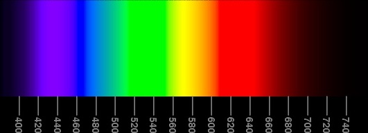 poor spectrum
to a much better version:
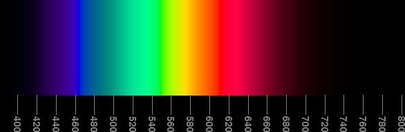 “a best compromise” spectrum
He calls that the “Best compromise” version. ;)
The reason why that particular rainbow is better is a combination of factors, but chief among them is that there are no wide bands of uniform color (unlike in the poor one, or even worse, in the Bruton’s algo version above4).
Reversing the “best compromise”
Trouble is – I don’t know enough color-fu to fully understand what Mr. Young explains on his page.
So I’ve done the next best thing, decided to reverse engineer what the spectra – and more importantly: their RGB channels – look like5:
viz.py (click to expand)
from PIL import Image
import numpy as np
from scipy import signal
from numpy.polynomial import Polynomial
import sys
import matplotlib.pyplot as plt

if len(sys.argv) <= 1:
    print("Usage: viz.py <file> [outfile(wavelength_viz.png)]")
    sys.exit(1)

img = Image.open(sys.argv[1])
img_array = np.array(img)

height, width = img_array.shape[:2]

# Step 1: Find the scale bars around x=150
scale_x = 150
scale_column = img_array[:, scale_x]

# Convert to grayscale for this column
if len(scale_column.shape) == 2 and scale_column.shape[1] >= 3:
    gray_scale = 0.299 * scale_column[:, 0] + 0.587 * scale_column[:, 1] + 0.114 * scale_column[:, 2]
else:
    gray_scale = scale_column

# Find bright pixels (scale marks)
threshold = np.mean(gray_scale) + 0.5 * np.std(gray_scale)
bright_pixels = gray_scale > threshold

# Find groups of bright pixels (the scale bars)
diff = np.diff(np.concatenate(([0], bright_pixels.astype(int), [0])))
starts = np.where(diff == 1)[0]
ends = np.where(diff == -1)[0]

# Filter for groups that are 2-3 pixels tall (the scale bars)
bar_positions = []
for start, end in zip(starts, ends):
    if 1 <= (end - start) <= 4:
        bar_positions.append((start + end) // 2)

bar_positions = np.array(bar_positions)

# Step 2: Map bars to wavelengths (800 to 400, 20nm intervals)
expected_marks = np.arange(800, 400-1, -20)
wavelengths = expected_marks[-len(bar_positions):]

# Step 3: Polynomial fit
poly = Polynomial.fit(bar_positions, wavelengths, deg=3)

# Step 4: Extract RGB data for ALL pixels
center_x = width // 2

data = []
for y in range(height):
    pixel = img_array[y, center_x]

    if len(pixel) == 4:
        r, g, b, a = pixel
    else:
        r, g, b = pixel

    wl = float(poly(y))
    data.append([y, round(wl, 2), int(r), int(g), int(b)])

def visualize_spectrum(data, out, show=True):
    data = np.array(data)
    wavelengths = data[:,1]

    rgb_values = data[:, -3:].astype(int)

    fig, (ax1, ax2) = plt.subplots(2, 1, figsize=(12, 8))

    for i in np.ndindex(wavelengths.shape):
        ax1.axvline(wavelengths[i], color=rgb_values[i]/256, linewidth=2)

    ax1.set_xlim(360, 800)
    ax1.set_ylim(0, 1)
    ax1.set_xlabel('Wavelength (nm)')
    ax1.set_ylabel('Intensity')
    ax1.set_title('Visible Spectrum')
    ax1.grid(True, alpha=0.3)

    ax2.plot(wavelengths, rgb_values[:, 0]/256, 'r-', label='Red', linewidth=2)
    ax2.plot(wavelengths, rgb_values[:, 1]/256, 'g-', label='Green', linewidth=2)
    ax2.plot(wavelengths, rgb_values[:, 2]/256, 'b-', label='Blue', linewidth=2)

    ax2.set_xlim(360, 800)
    ax2.set_ylim(0, 1)
    ax2.set_xlabel('Wavelength (nm)')
    ax2.set_ylabel('RGB Component Value')
    ax2.set_title('RGB Components across Spectrum')
    ax2.legend()
    ax2.grid(True, alpha=0.3)

    plt.tight_layout()
    plt.savefig(out, dpi=150, bbox_inches='tight')
    if show:
        plt.show()

out = sys.argv[2] if len(sys.argv)>2 else 'wavelength_viz.png'
visualize_spectrum(data, out, False)
print(f"Saved as: {out}")
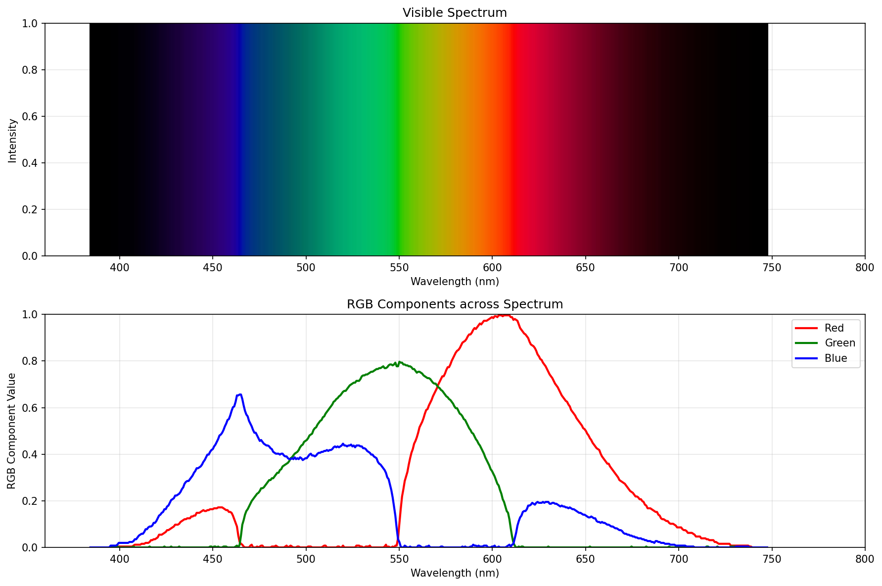
If you’re not fluent in Claude-generated Python that was hand edited by yours truly, then the idea is to use the axes to figure out what pixels roughly correspond to what wavelengths, then polyfit the actual wavelength values6, and then parse the color pixels into RGB values, to actually see the curves7.
Without further ado, here are reverse engineered RGB curves of the spectral pictures from Mr. Young’s article, in sequence:
First example (bad spectrum)
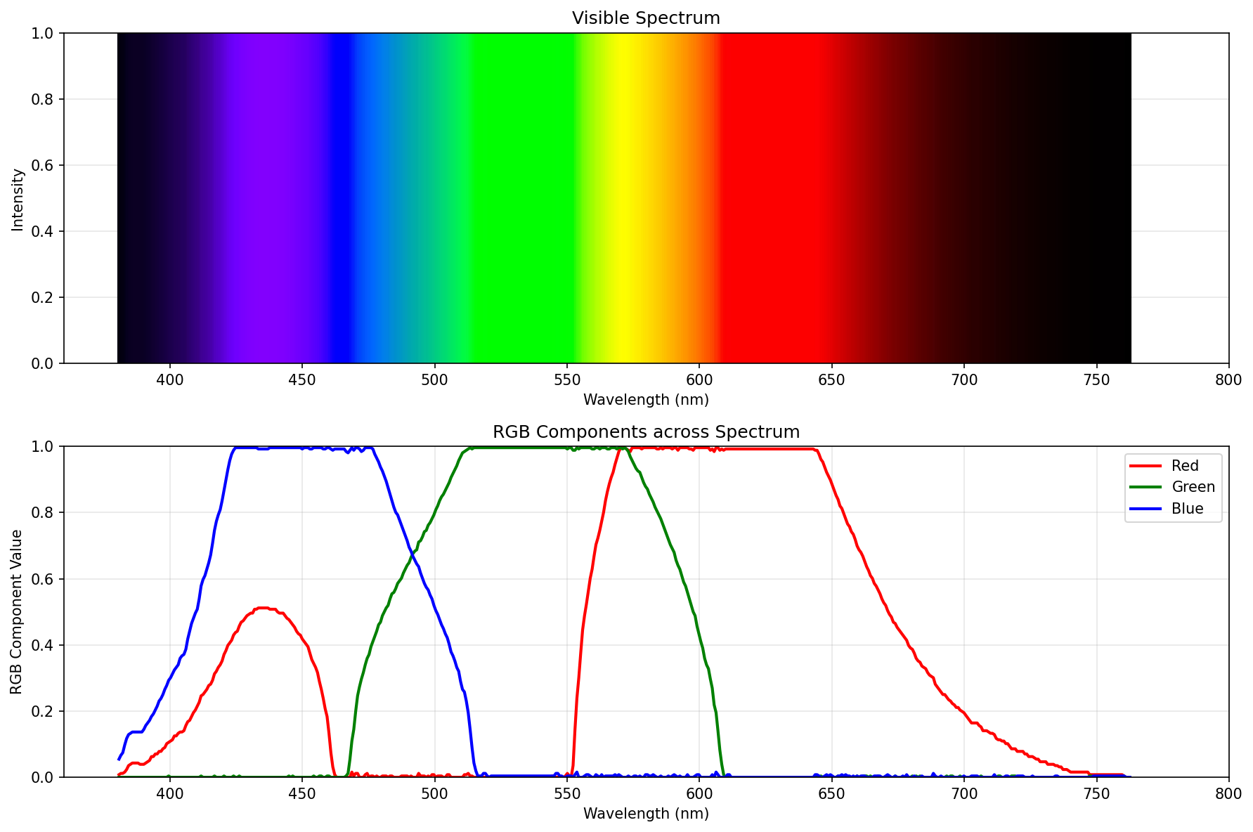
Second approximation
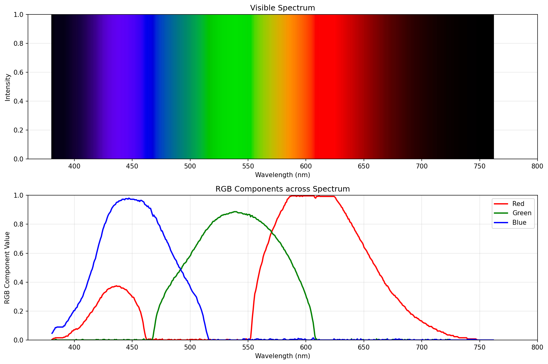
Reduced brightness
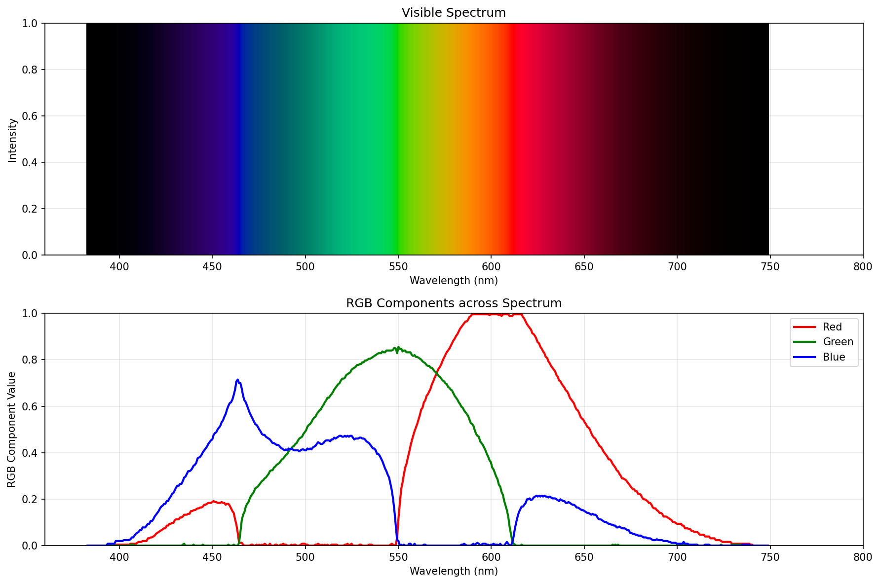
Darkened further
Constant power
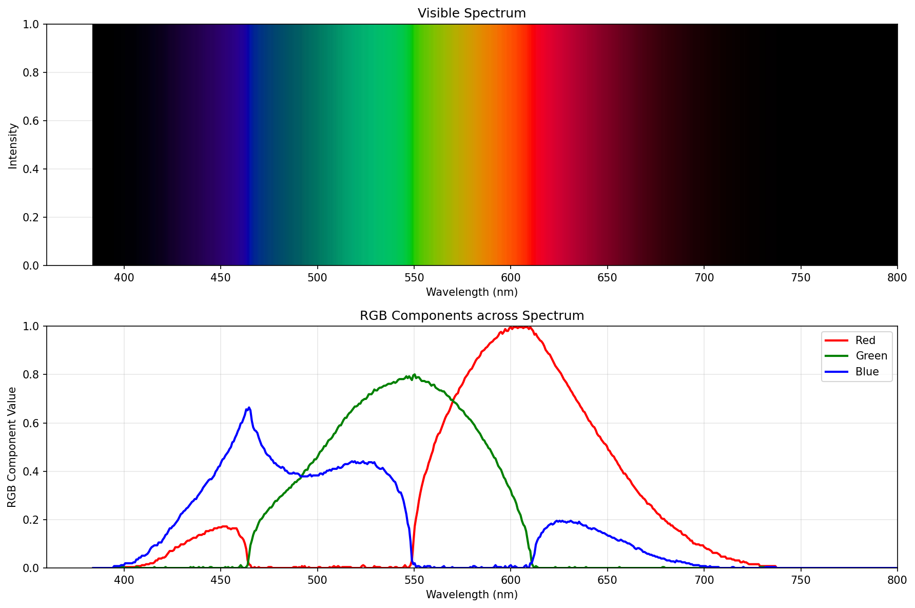
Brightest possible spectrum
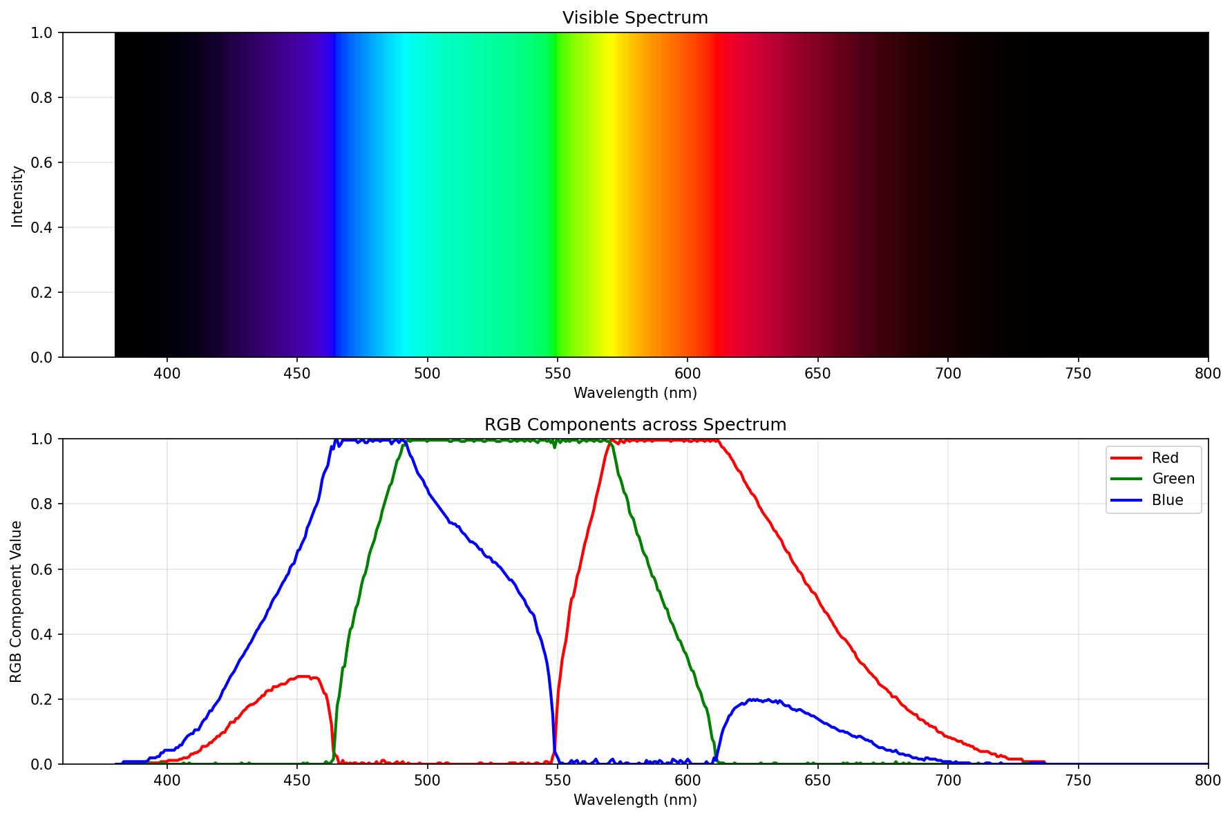
Best spectrum (the final boss)
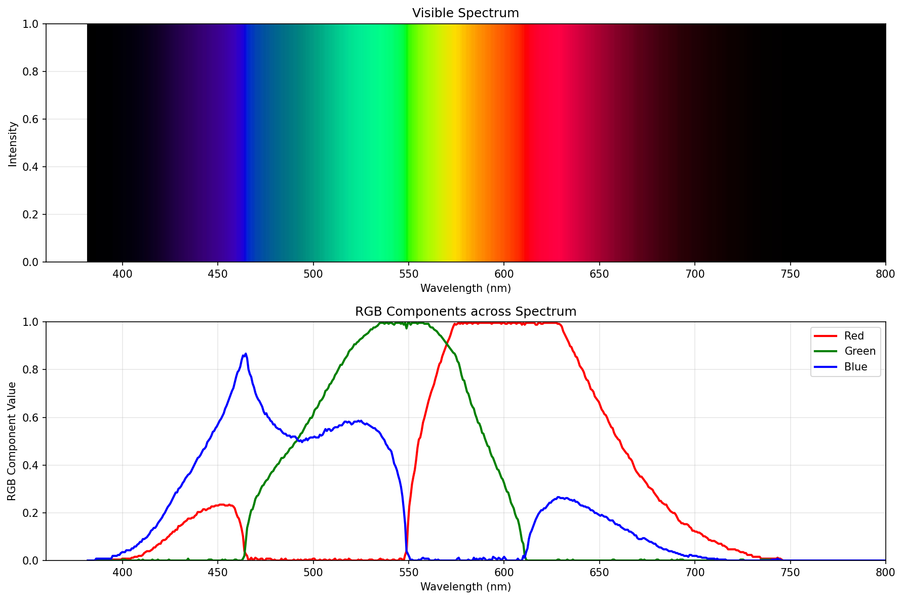
Great, we know the form of the final boss, as well as the rough steps how he takes its shape.
Writing my own
So let’s write up the final boss using primitives from colour-science.
That’s actually super easy, barely an inconvenience8:
import numpy as np
import matplotlib.pyplot as plt
from colour import MSDS_CMFS, XYZ_to_sRGB
from colour.models import eotf_inverse_sRGB


def wavelength_to_rgb(wavelength):
    cmfs = MSDS_CMFS['CIE 2015 2 Degree Standard Observer']

    if wavelength < 360 or wavelength > 830:
        return (0.0, 0.0, 0.0)

    wl_range = cmfs.wavelengths
    x_bar = np.interp(wavelength, wl_range, cmfs.values[:, 0])
    y_bar = np.interp(wavelength, wl_range, cmfs.values[:, 1])
    z_bar = np.interp(wavelength, wl_range, cmfs.values[:, 2])

    X = x_bar
    Y = y_bar
    Z = z_bar

    XYZ = np.array([X, Y, Z])

    rgb_linear = XYZ_to_sRGB(XYZ, apply_cctf_encoding=False)

    r, g, b = rgb_linear

    if r < 0 or g < 0 or b < 0:
        min_component = min(r, g, b)
        if Y > 0:
            factor = Y / (Y - min_component)
            r = Y + factor * (r - Y)
            g = Y + factor * (g - Y)
            b = Y + factor * (b - Y)

    # hand tuned for perfection
    brightness_boost = 1/1.4
    r *= brightness_boost
    g *= brightness_boost
    b *= brightness_boost

    max_component = max(r, g, b)
    if max_component > 1.0:
        r /= max_component
        g /= max_component
        b /= max_component

    r = max(0.0, min(1.0, r))
    g = max(0.0, min(1.0, g))
    b = max(0.0, min(1.0, b))

    # gamma correct me, baby
    r = eotf_inverse_sRGB(r)
    g = eotf_inverse_sRGB(g)
    b = eotf_inverse_sRGB(b)

    return (r, g, b)


def visualize_spectrum():
    wavelengths = np.linspace(360, 800, 441)

    rgb_values = np.array([wavelength_to_rgb(wl) for wl in wavelengths])

    fig, (ax1, ax2) = plt.subplots(2, 1, figsize=(12, 8))

    for i in range(len(wavelengths)):
        ax1.axvline(wavelengths[i], color=rgb_values[i], linewidth=2)

    ax1.set_xlim(360, 800)
    ax1.set_ylim(0, 1)
    ax1.set_xlabel('Wavelength (nm)')
    ax1.set_ylabel('Intensity')
    ax1.set_title('Visible Spectrum')
    ax1.grid(True, alpha=0.3)

    ax2.plot(wavelengths, rgb_values[:, 0], 'r-', label='Red', linewidth=2)
    ax2.plot(wavelengths, rgb_values[:, 1], 'g-', label='Green', linewidth=2)
    ax2.plot(wavelengths, rgb_values[:, 2], 'b-', label='Blue', linewidth=2)

    ax2.set_xlim(360, 800)
    ax2.set_ylim(0, 1)
    ax2.set_xlabel('Wavelength (nm)')
    ax2.set_ylabel('RGB Component Value')
    ax2.set_title('RGB Components across Spectrum')
    ax2.legend()
    ax2.grid(True, alpha=0.3)

    plt.tight_layout()
    plt.savefig('spectrum_visualization.png', dpi=150, bbox_inches='tight')
    plt.show()


if __name__ == '__main__':
    visualize_spectrum()

    print("Sample wavelengths:")
    for wl in [400, 450, 520, 580, 620, 630, 640, 650]:
        rgb = wavelength_to_rgb(wl)
        print(f"{wl} nm: RGB({rgb[0]:.3f}, {rgb[1]:.3f}, {rgb[2]:.3f})")
So, how does it perform? Pretty well:
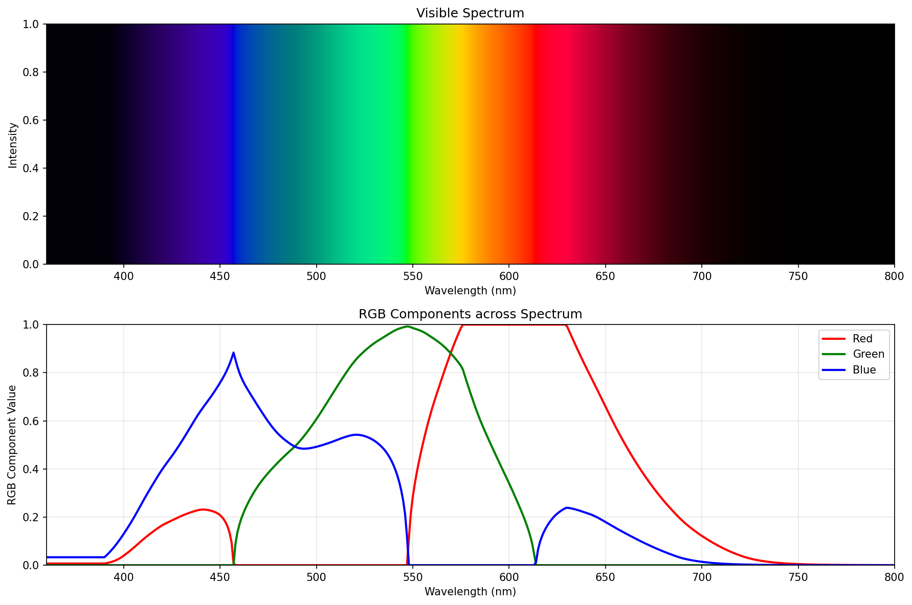 Proper spectrum (the “best compromise”), using just colour-science
If you ignore the fuckery below 390nm, it’s pretty much the same. Probably differs a tiny bit because I used “CIE 2015 2° Standard Observer”, and the green is just a wee bit off around the peak.
But hey, this ain’t half bad, right?
Great, we have the “best compromise” spectrum reversed.
Getting to “fast”
Getting to “fast” is probably the boring bit. What do you do when you want something unchanging computed fast?
You don’t compute it.
You precompute it, and plop the precomputed table in the source code.
Well, that, plus another critical insight: Why would one generate a million of teeny tiny actors all over the canvas, if one can use one-pixel high strip of precomputed goodness (think one px tall image of decent width), and stretch + clip that?
The full extent of the goodness can be found in this commit in tobes-ui, but this is the gist of it:
self.axes.set_aspect('auto')
use_range = self.data.wavelength_range

# Create clipping path from the data curve
verts = [(spd.wavelengths[0], 0)]
for x, y in zip(spd.wavelengths, spd.values):
    verts.append((x, y))
verts.append((spd.wavelengths[-1], 0))
verts.append((spd.wavelengths[0], 0))

clip_path = Path(verts)

rainbow = get_rainbow_for_range(use_range.start, use_range.stop)

y_max = spd.values.max()

im = self.axes.imshow(rainbow, aspect='auto',
               extent=[use_range.start, use_range.stop, 0, y_max * 1.05],
               origin='lower', zorder=0)

# Apply clipping path to the rainbow image
patch = PathPatch(clip_path, transform=self.axes.transData,
                 facecolor='none', edgecolor='none')
self.axes.add_patch(patch)
im.set_clip_path(patch)

# Plot the actual line
self.axes.plot(spd.wavelengths, spd.values, 'k-', linewidth=1.5, zorder=10)

wl_range = self.data.wavelength_range
if self.vis_x:
    self.axes.set_xlim(self.VISIBLE_SPECTRUM.start, self.VISIBLE_SPECTRUM.stop + 1)
else:
    self.axes.set_xlim(wl_range.start, wl_range.stop)

plt.xlabel("Wavelength $\\lambda$ (nm)")
plt.ylabel(f'{self.YLABEL} ({self.data.y_axis})')
plt.title(self._graph_title(spd))
I just totally scientifically(™) measured9, and it renders in 0.01-0.02s, which is some 10-50x speedup. Not bad if I do say so myself.
And how does it look? All better:
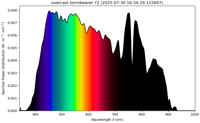 new tobes-ui spectrum graph
Here’s a diff:
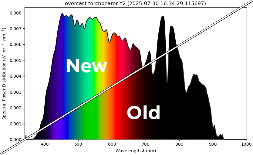 diff of the tobes-ui spectrum graph
Closing words
This was a relatively deep rabbit hole to fall into. But, the upside is that the spectrum graph of tobes-ui now looks better (to my eyes, anyway), and it renders 10-50x faster.
And I don’t think I would have done it in 1.5 afternoons, if it weren’t for the excellent write-up by Andrew T. Young10, or the LLMs11.
Obviously all of this is very context specific (aimed at improving tobes-ui), so I wouldn’t reco something like this in your next pacemaker project. But you ain’t coming for that sort of content here, are you? Are you?
-
Despite my only passing familiarity with things like CIE2015, sRGB, gamma correction, etc. ↩
-
Firmly standing on the shoulders of giants here. ↩
-
The reason is that this use of CIE2015 clips like crazy. ;) So the
plot_single_sdactually does a reasonable job. ↩ -
I’d like to point out that the Bruton’s algo doesn’t have to be the actual Bruton’s algo, but LLM’s take on the algo. Just FYI, so I don’t offend anyone. ↩
-
Obviously this is a brittle one-off jobbie. ↩
-
Gee, where have I seen that approach, right? ↩
-
Because just like you, fellow human, I don’t quant-speak color that well. ↩
-
You prompt Claude with markdown dumped from Mr. Young’s site, and then you reprompt it until you beat it to submission. And then you hand-edit the result to be exactly as you want it. ↩
-
Δ of two
time.perf_counter()around theself._draw_graph()↩ -
Whose work I thoroughly stole. Thank you, good sir! ↩
-
Don’t get me wrong, their output is sus until proven otherwise, but definitely helpful as a speedup. Or as a rubber duck. ↩